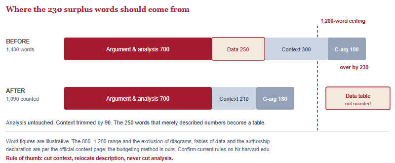
The official contest page states that articles “should be at least 800 words but not exceed 1,200 words (not counting diagrams, tables of data, or authorship declaration).” That parenthesis is the most under-used sentence in the entire brief. Used well, it lets a 1,400-word draft become a compliant 1,150-word essay without losing a single idea. Used badly, it produces decoration that costs you credibility.
Almost every strong first draft we see from a China-based international-school student comes in over the ceiling. That is a good sign — it means there was real reading behind it. The question is what you cut. Most students cut analysis, because analysis is the hardest thing to write and therefore the easiest thing to doubt. That is exactly backwards, and the exclusion rule is what lets you avoid it.
What the rule says, and the two mistakes it produces
Three categories sit outside the count: diagrams, tables of data, and the authorship declaration. Everything else — your prose, your headline, your introduction, your conclusion — is inside it. Confirm the current wording on hir.harvard.edu before you plan around it, because contest rules do move between cycles.
The rule reliably produces two opposite errors.
Error one: ignoring it entirely. The student writes 1,380 words of prose, panics, and deletes the two paragraphs where the essay was actually doing analytical work, because those paragraphs “felt like extra.” The essay lands at 1,190 words and reads like a summary. This is the more common of the two, and the more expensive.
Error two: treating it as free real estate. The student discovers that tables do not count, and bolts on four of them — a table of definitions, a table of dates, a table of countries, a table of “key statistics” — none of which the prose ever refers to. The word count is now compliant and the article now looks like a school poster. An evaluator reading for argument sees padding, and padding is a signal about the writer, not just the page.
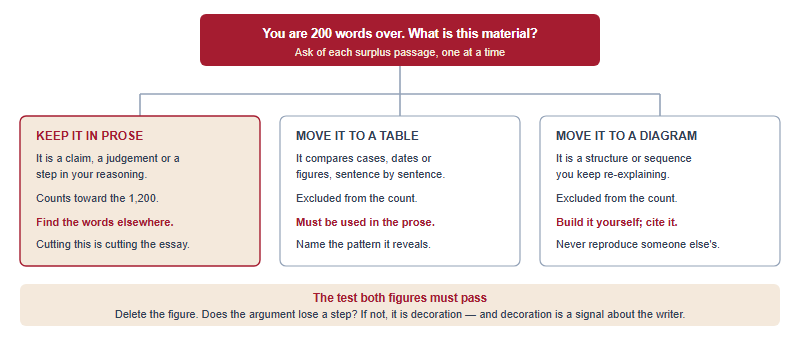
The correct use sits between the two, and it has one governing test: a figure earns its place only if the prose is worse without it. Not shorter — worse.
What a table has to do to earn its place
A table is not a container for facts. It is an argumentative device, and it does one job better than any paragraph: it makes a comparison visible in a single glance so that your prose can spend its words on why the comparison matters instead of on establishing it.
That distinction produces a hard test. Ask of every table: what does the reader now understand that they could not have understood from the sentence “these three cases differ”? If the answer is “the specifics,” keep the table. If the answer is “nothing, it just looks thorough,” delete it.
The second test is integration. A table that the prose never mentions is orphaned, and an orphaned table reads as padding regardless of how good the data is. Every figure in a competitive 1,200-word article should be referenced in the body at least once, and the reference should do analytical work — not “as shown in Table 1,” but “the pattern in Table 1 is not uniform: the two coastal cases move together while the inland case does not, which is the point at which the standard explanation stops working.”
The contest points readers to an evaluation rubric set out in its Submission Guide, and what is scored is the article. A table does not earn points by existing. It earns points indirectly, by buying you back the words in which you demonstrate analysis — which is where the marks actually live. Our own reading of how those marks are distributed is in our breakdown of the 60-point rubric; check it against the current Submission Guide before you rely on it.
Three table patterns that carry an argument
Almost every table worth including in a 1,200-word analytical article falls into one of three shapes. Each replaces a specific kind of bloated prose.
| Pattern | Columns | The prose it replaces | What the body text then does |
|---|---|---|---|
| Comparison of cases | Case | Condition A | Condition B | Outcome | Three paragraphs each describing one country, company or period in turn | Names the pattern and, more importantly, the case that breaks it |
| Mechanism and consequence | Step | What changes | Who is affected | Evidence | A long chain of “which leads to… which in turn leads to…” sentences | Attacks the weakest link in the chain and defends it explicitly |
| Position and objection | Claim | Strongest counter | What the evidence favours | A counterargument section that lists objections and answers them one by one | Explains why the balance of evidence falls where it does, in prose |
Notice what all three have in common. The table holds the settled material — what happened, what the numbers are, what the objections are — and the prose holds the contested material, which is your reading of it. That division is exactly the “argument, not agenda” posture the contest describes: you are showing the reader the evidence base openly and then arguing from it, rather than asking them to take your summary on trust.
The third pattern deserves a warning. A position-and-objection table is powerful and it is also the fastest way to look like you are avoiding the argument. If you tabulate the counterarguments and never engage them in prose, you have listed your opponents rather than answered them. The table sets up the work; it is not the work.
Diagrams: structure, sequence, and the sourcing line
A diagram does something a table cannot: it shows relationships that are not rows. Use one when your argument depends on a structure the reader has to hold in their head — a chain of causation, a set of overlapping actors, a sequence of policy changes, a feedback loop. If you find yourself re-explaining the same structure in paragraph three and again in paragraph six, that structure wants to be a diagram.
Three rules keep a diagram on the right side of the credibility line.
- Build it yourself. Do not lift a chart out of a report, a news article or a textbook. Beyond the copyright problem, a reproduced figure tells an evaluator nothing about your thinking. A simple diagram you constructed from public figures tells them a great deal.
- Say where the underlying data came from. A caption that names the source is the difference between analysis and assertion. If the figures come from a public dataset or an institutional report, cite it the way the contest requires — the official page states that citations should be made via hyperlinks, with AP Style formatting for non-digital sources.
- Keep it readable at one glance. Judges are reading many entries. A diagram with fourteen boxes and eleven arrows is not sophisticated; it is unreviewed. Six elements is usually the ceiling.
One further caution specific to students writing from China: if your diagram summarises data from a source that is difficult to reach from where your reader is, or vice versa, make the caption self-sufficient. The figure should still make sense to someone who never clicks the link.
Citing inside a figure when citations are hyperlinks
The contest asks for citations made via hyperlinks, with AP Style's newest edition governing the writing and non-digital sources cited in AP Style. That creates a small practical question inside tables and captions, and the answer is a matter of craft rather than rule.
Hyperlink the shortest meaningful phrase, not the number. A cell reading “62% (2024 ministry survey)” with the parenthetical linked is readable; a cell where the figure itself is a blue underlined “62%” is not, and it breaks badly if the article is printed or read as plain text. Keep one source per cell where you can. If a whole table draws on one dataset, put a single linked attribution in the caption rather than repeating it in every row.
And write captions that survive without the link. A caption reading “Source: as above” is worthless to an evaluator scanning quickly. “Compiled by the author from the 2024 annual report of [institution]” tells them who did the work, where the numbers came from, and that you understand the difference. Our fuller treatment of attribution inside a hyperlink-only system is in our overview of how the contest is set up and what it asks for.
The authorship declaration: free words you should not rush
The declaration sits outside the word count too, which means there is no length pressure on it whatsoever. Students still leave it to the last twenty minutes, and it is the one component where carelessness has a disproportionate cost — because it is the document in which you assert that the work is yours, in a contest that prohibits AI tools and runs multiple AI-detection checks.
The contest page does not publish the declaration's format, referring entrants to its Submission Guide, so follow that document rather than a template you found elsewhere. Two things are worth checking regardless of the form it takes: that you have written it yourself in your own voice, and that everything it asserts is true — including how you used any tools, and what help you received on drafts. A declaration written casually and then discussed at a 15-minute oral defense is not a comfortable combination. Our Defense Day preparation guide covers the wider point: everything you submit is potentially something you will be asked about aloud.
A worked reallocation
Here is the routine, in the order we run it with students who arrive at 1,400-plus words.
- Highlight every sentence whose only job is to state a number, a date or a name. These are candidates for relocation, not deletion. In a typical over-length draft this comes to 150–300 words.
- Group them. If they compare things, they are a table. If they describe a structure, they are a diagram. If they do neither, they were probably never necessary.
- Build the figure, then rewrite the surrounding prose — do not simply delete it. The sentence that replaces the removed passage should say what the figure means. This is the step students skip, and skipping it turns a good move into an obvious one.
- Trim context, not argument. Background paragraphs almost always contain 20–30% that a well-read evaluator does not need.
- Recount, then read the whole thing aloud. If the essay now reads as a set of captions joined by connective tissue, you have gone too far and should move something back into prose.
For what it is worth, drafts that arrive over the limit have generally been the healthier starting point among students we have supported — in 2023 more than half of the students we entered reached the final defence and 14 took global awards, and in 2024 one reached the final defence with others taking Outstanding Writing Content and a Commendation Prize. Those figures are de-identified and reported per Hanlin's own records; they describe past cohorts, results vary, and nothing here predicts any individual outcome.
Questions students ask about figures and the word limit
Do captions count toward the 1,200 words?
The official page excludes diagrams, tables of data and the authorship declaration, without detailing captions. Confirm on hir.harvard.edu rather than assuming.
How many tables or diagrams should I include?
The page sets no number. In a 1,200-word article, one or two that the prose actively uses is usually the ceiling.
Can I paste a chart from a report I cited?
Avoid it. Build your own figure from the underlying public data and attribute the source in the caption.
Does a table make up for being under 800 words?
No. The 800-word floor applies to the counted text, and a thin argument is visible regardless of how many figures surround it.
This is an independent guide operated by Hanlin Education for China-based international-school students. We are not affiliated with, endorsed by, or sponsored by the Harvard International Review or Harvard University; the HIR is a student-run journal founded in 1979 and is not an official Harvard University body. Word limits, formatting rules and submission requirements change between cycles — confirm all current details on hir.harvard.edu before acting on anything here. Errors reported to us are corrected within 7 working days.